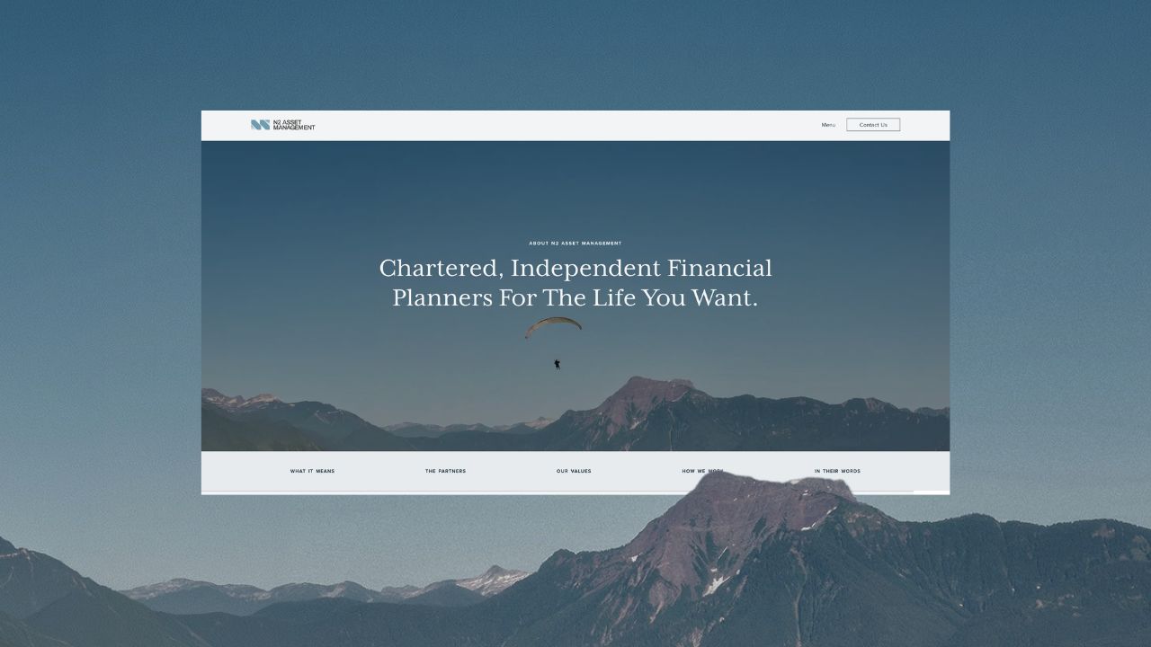
A brand and website built to say the right thing to the right people
N2 Asset Management
Website Build
Content Provided
Brand Strategy
The brief
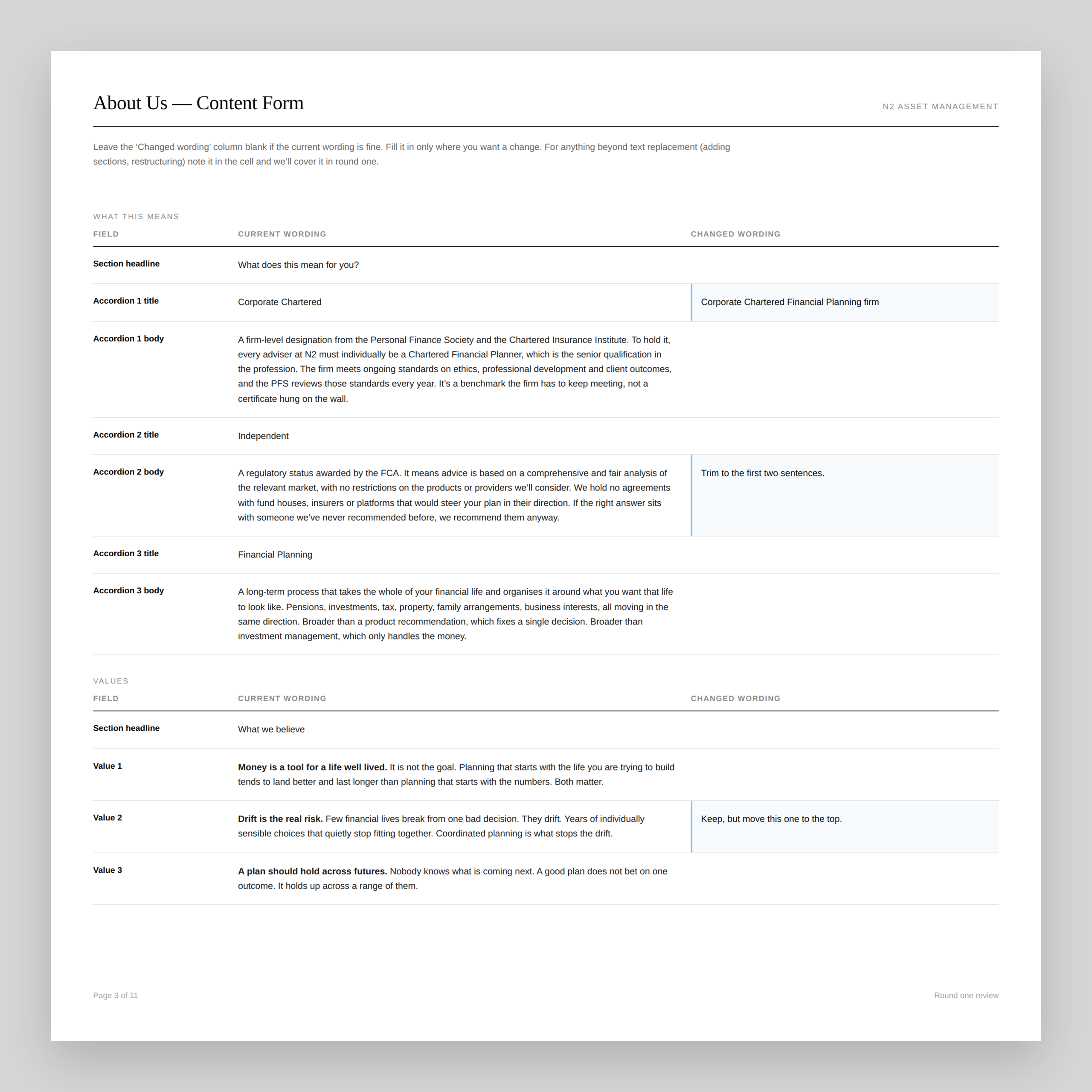
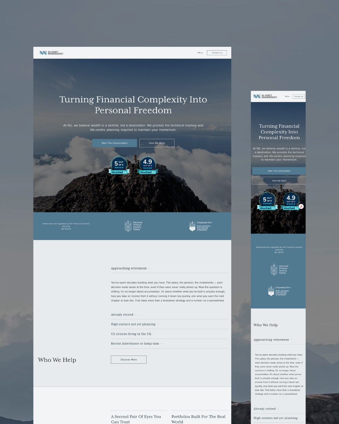
N2 Asset Management had built their first site themselves on Wix in the early days. It had the basics on it, but it was built by a smaller, younger version of the business, and it hadn't kept up. There was no clear path through the site. Pages opened cold with no hero text, then ran into dense blocks a visitor had to wade through just to work out if they were in the right place. Nothing was consistent from page to page. And the overall look undersold them, making a credible firm read as less credible than it was. The job was to fix that. To make the site look as credible as the firm behind it, and to make N2 easier to find, both for people already searching for them and for the people they hadn't reached yet.
Business
UK Independent Financial Adviser
Compliance
Compliant content included, signed off by N2
Design involvement
3 initial directions, feedback rounds included
Brand strategy
Aligned business goals, their audience, and brand voice and visuals
Care
30 days post-launch support included
Built for
Credibility, Discoverability, Ease of Use
More than just a digital brochure
Here's what an IFA website needs to look credible
The simple one, done properly
Naturally, this is the first thing anyone thinks of, and for good reason. A visitor decides how they feel about a firm before they've read a word of it.
A lot of that is just design done properly. Hierarchy, spacing, grids, typography, contrast. There are whole sciences behind each one, which is why you'd pay a designer.
But would a template tick those boxes?
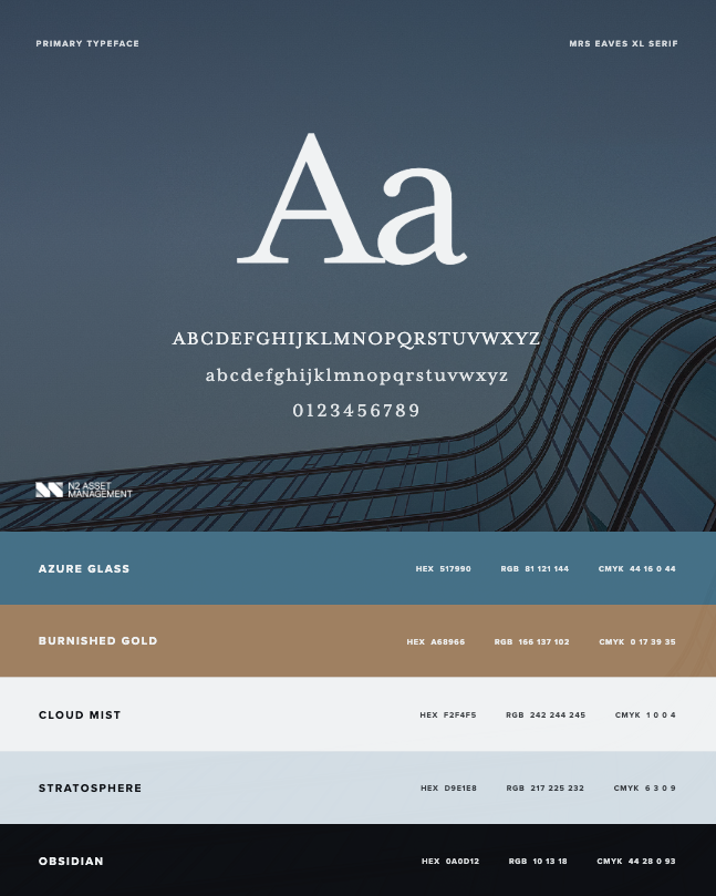
Yes it would... and yet it still doesn't look credible. Why? Because it's built to suit any business and so belongs to none. There's nothing behind it to recognise. People trust what looks like it was made by someone who thinks the way they do, so the design (colours, typography, imagery, etc.) has to carry what the firm believes.
Think about it - an eco-minded client reads a page with greens and trees as a signal before a single word has been read. So it has to fit your business and your clients.
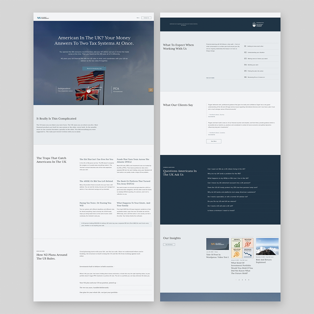
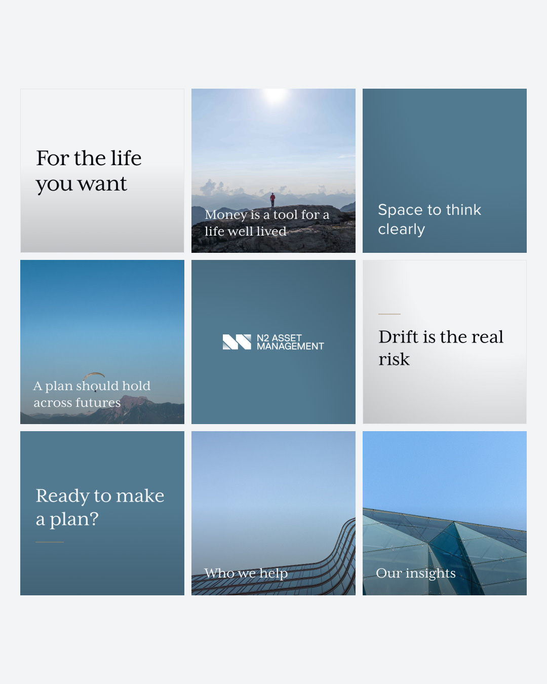
After a workshop and rounds of iteration, N2 wanted to be known for one belief: money is a means, not an end, and the end is freedom. Everything else came from there. Wide landscapes and open sky, clean architecture for the structure, a cool and quiet palette, and a classic serif that reads established without feeling dated.
This alignment of every decision feels trustworthy to visitors.